Tour O The Borders
ClientHillside Outside
Services Branding / UI / UX design / Web Development / E-Commerce / Marketing Materials /
Visit Site tourotheborders.com

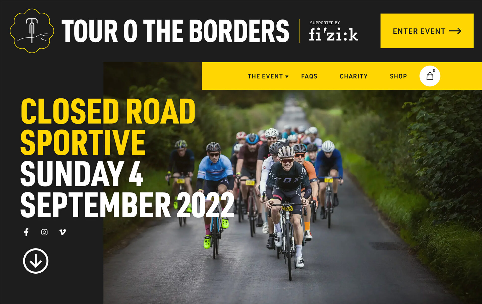
Tour O The Borders is an annual road sportive with mile after mile of spectacular scenery on some of Scotland’s finest cycling terrain. In fact, we believe it is the most beautiful closed road ride you will experience in the UK, so we were absolutely thrilled to get the opportunity to create a new website for them.
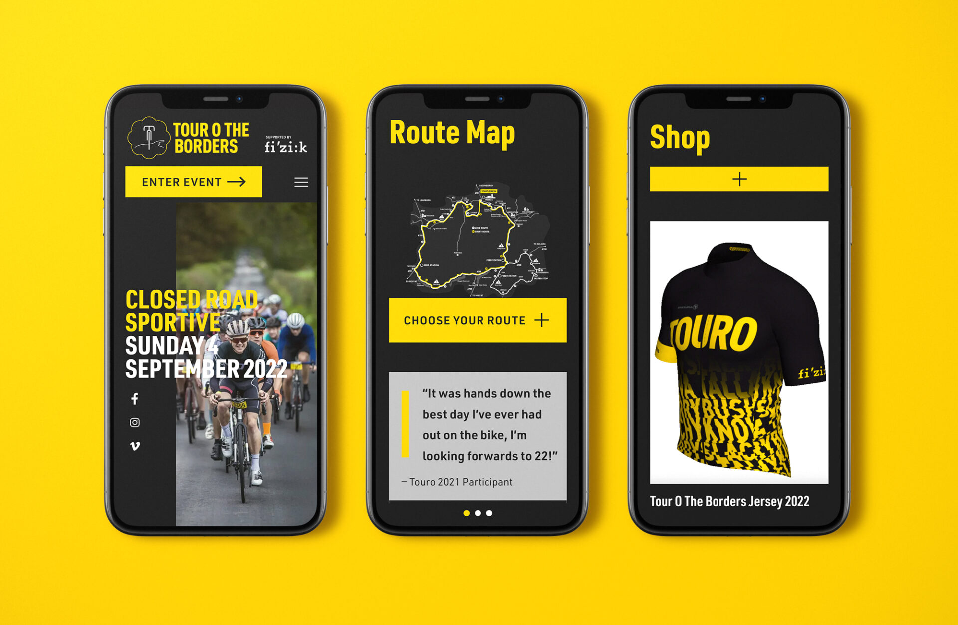
The event has evolved massively since its start in 2012, and we’ve been riding with them all the way since the beginning. The original website effectively served participants with the necessary information over the years, but it perhaps struggled to keep up with the pace and standard set by the event itself. A mobile-first approach to design and development that boosts performance and speed was therefore welcomed by all.

Fast and lightweight pages ensure that browsing in rural areas with low bandwidth will not compromise its users finding the information needed, even at times of high traffic.
This approach also involves delivering a more resource-efficient product, that is more accessible and digitally sustainable, a goal that should be set for any modern digital project. To measure this, we used Ecograder, a tool that prioritises a holistic approach to digital sustainability. It scores the carbon dioxide the page emits every time someone visits it by measuring the user experience, page sizes, site performance and green hosting. We’re pleased to say that Touro passed this test with flying colours!

In addition to the website, we’ll continue to support in the delivery of any design as required, from posters and leaflets to bike number boards.